Chapter 5
Correlation
Correlation is very common, and in large data sets, pretty much every variable is correlated to some degree. Since correlations do not indicate causal relationships, we need a way to distinguish association from evidence of causation.
Multivariate regression is one such tool for this and there are several reasons why they are popular.
They allow for “control” for confounds. A confound is a variable which has no real importance, but because of it’s correlation might appear important. Be careful though! Confounds can hide real important variables just as easily as they can produce false ones. Simpson’s Paradox found that the entire direction of an apparant association between a predictor and outcome can be reversed by considering a confound.
Multiple causation. Even when confounds are absent, it is entirely possible that phenomenon may arise from multiple causes. When causation is multiple, one cause can hide another.
Interactions. Even when variables are completely uncorrelated, the importance of each may still depend upon the other. For example, plants benefit from both light and water, but if either were abscent, there would be no benefit at all.
Spurious association
Let’s consider divorce rates with the following linear regression model.
We’re going to start by standardizing our predictor variable. Priors are our expectations about the parameters before seeing the sample. We set them based on background scientific knowledge, not upon peeking at the data. This is why standardizing is so important. By setting variables (v) equal to
data(WaffleDivorce)
d <- WaffleDivorce

# standardize predictor
d$MedianAgeMarriage.s <- (d$MedianAgeMarriage - mean(d$MedianAgeMarriage))/sd(d$MedianAgeMarriage)

# fit model
m <- quap(
  alist(
    Divorce ~ dnorm(mu, sigma),
    mu <- alpha + beta*MedianAgeMarriage.s,
    alpha ~ dnorm(10, 10),
    beta ~ dnorm(0, 1),
    sigma ~ dunif(0, 10)
  ), data = d)

precis(m)
##            mean        sd      5.5%      94.5%
## alpha  9.688224 0.2045084  9.361380 10.0150679
## beta  -1.042823 0.2025347 -1.366513 -0.7191339
## sigma  1.446395 0.1447674  1.215029  1.6777614
# sd(d$MedianAgeMarriage)
# 1.24

# compute percentile interval of mean
MAM.seq <- seq(from = -3, to = 3.5, length.out = 30)
mu <- link(m, data = data.frame(list(MedianAgeMarriage.s = MAM.seq)))
mu.PI <- apply(mu, 2, PI)

# plot it all
plot(Divorce ~ MedianAgeMarriage.s, data = d, col = rangi2)
abline(m)
shade(mu.PI, MAM.seq)
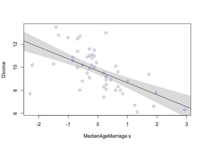
From the table we can see that for each additional standard deviation of delay in marriage (1.24 years), predicts a decrease of about one divorce per thousand adults with a 89% interval from about -1.37 to -0.72. Even though the magnitude may vary a lot, we can still say that it’s reliably negative.
d$Marriage.s <- (d$Marriage - mean(d$Marriage))/sd(d$Marriage)
m2 <- quap(
  alist(
    Divorce ~ dnorm(mu, sigma),
    mu <- alpha + beta*Marriage.s,
    alpha ~ dnorm(10, 10),
    beta ~ dnorm(0, 1),
    sigma ~ dunif(0, 10)
  ), data = d)

precis(m2)
##            mean        sd      5.5%     94.5%
## alpha 9.6881748 0.2364320 9.3103108 10.066039
## beta  0.6437544 0.2324645 0.2722313  1.015278
## sigma 1.6722941 0.1673041 1.4049099  1.939678
# sd(d$Marriage)
# 3.8

# compute percentile interval of mean
Marriage.seq <- seq(from = -3, to = 3.5, length.out = 30)
mu2 <- link(m2, data = data.frame(list(Marriage.s = Marriage.seq)))
mu2.PI <- apply(mu2, 2, PI)

# plot it all
plot(Divorce ~ Marriage.s, data = d, col = rangi2)
abline(m2)
shade(mu2.PI, Marriage.seq)
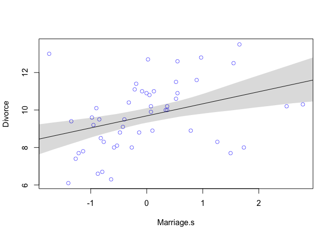
The table output shows that for every additional standard deviation of marriage rate (3.8), there is an increase of 0.6 divorces. Looking at the plot we can see that this relationship isn’t as strong as the previous one.
What is the predictive value of a variable, once we already know all the other predictor variables?
Once we fit a multivariate model to predict divorce using both marriage rate and age at marriage, the model will answer the following:
- After we already know marriage rate, what additional value is there in also knowing age at marriage?
- Afte we already know age at marriage, what additional value is there in also knowing marriage rate?
Directed Acyclic Graphs (DAGS)
As we just saw above, there could be multiple causes for divorce. But the statistical models we have can’t actually tell us what the causal implications are. Directed Acyclic Graphs or DAGS, are tools for visualizing these causal models. Let’s take a quick moment to break down the name DAG:
- Directed: There are arrows
- Acyclic: There are no cycles
- Graphs: There are nodes and edges
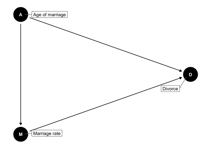
The implications from this are:
- Marriage rate is a function of median age of marriage
- Divorce is a function of marriage rate and median age of marriage
- The total causal effect of median age of marriage has two paths: a. A -> M -> D b. A -> D
Multivariate Notation
If we want a model that predicts divorce rate using both marriage rate and age at marriage, the methods are very similar to how we defined polynomial models before:
- Select the predictor variables you want in the linear model of the mean
- For each predictor, make a parameter that will measure its association with the outcome
- Multiply the parameter by the variable and add that term to the linear model
# Now fitting the model in R
m <- quap(
  alist(
    Divorce ~ dnorm(mu, sigma),
    mu <- alpha + betaR*Marriage.s + betaA*MedianAgeMarriage.s,
    alpha ~ dnorm(10, 10),
    betaR ~ dnorm(0, 1),
    betaA ~ dnorm(0, 1),
    sigma ~ dunif(0, 10)
  ), data = d)

knitr::kable(cbind(precis(m), cov2cor(vcov(m))), digits = 2)
| mean | sd | 5.5% | 94.5% | alpha | betaR | betaA | sigma | |
|---|---|---|---|---|---|---|---|---|
| alpha | 9.69 | 0.20 | 9.36 | 10.01 | 1 | 0.00 | 0.00 | 0.00 |
| betaR | -0.13 | 0.28 | -0.58 | 0.31 | 0 | 1.00 | 0.69 | 0.05 |
| betaA | -1.13 | 0.28 | -1.58 | -0.69 | 0 | 0.69 | 1.00 | 0.07 |
| sigma | 1.44 | 0.14 | 1.21 | 1.67 | 0 | 0.05 | 0.07 | 1.00 |
The posterior mean for marriage rate,
plot(precis(m))
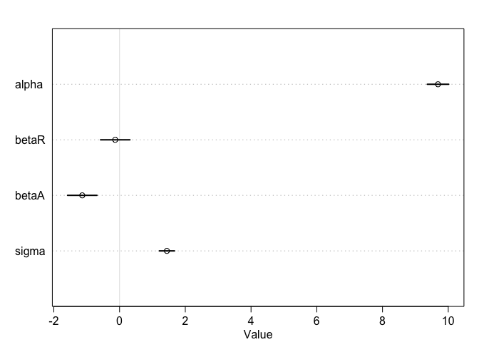
Interpretation: Once we know median age at marriage for a State, there is little or no additional predictive power in also knowing the rate of marriage in that State.
Plotting mutlivariate posteriors
Plotting multiple linear regression is difficult because it requires a lot of plots, and most do not generalize beyond linear regression. Instead, we’ll focus on three types of interpretive plots:
- Predictor residual plots. These plots show the outcome against residual predictor values. It’s probably not recommended to use this method moving forward, however, it’s a good way to visualize what the multivariate regression is doing underneath the hood.
- Counterfactual plots. These show the implied predictions for imaginary experiments in which the different predictor variables can be changed independently of one another.
- Posterior prediction plots. These show model-based predictions against raw data, or otherwise display the error in prediction.
Predictor residual plots
In our multivariate model of divorce rate, we have two predictors (1) marriage rate (Marriage.s) and (2) median age at marriage (MedianAgeMarriage.s). To compute predictor residuals for either, we just use the other predictor to model it. So for marriage rate, this is the model we need.
As before,
m <- quap(
  alist(
    Marriage.s ~ dnorm(mu, sigma),
    mu <- alpha + beta*MedianAgeMarriage.s,
    alpha ~ dnorm(0, 10),
    beta ~ dnorm(0, 1),
    sigma ~ dunif(0, 10)
  ), data = d)
Now that we have the model, we compute the residuals by subtracting the observed marriage rate in each State from the predicted rate, based upon using age at marriage.
# compute expected value
mu <- coef(m)['alpha'] + coef(m)['beta']*d$MedianAgeMarriage.s

# compute residual for each State
m.resid <- d$Marriage.s - mu
d %>%
  ggplot(aes(x = MedianAgeMarriage.s, y = Marriage.s)) +
  geom_point(size = 2, shape = 1, color = "royalblue") +
  geom_segment(aes(xend = MedianAgeMarriage.s, yend = mu), size = 1/4) +
  geom_line(aes(y = mu)) +
  coord_cartesian(ylim = range(d$Marriage.s)) +
  theme_bw() +
  theme(panel.grid = element_blank())
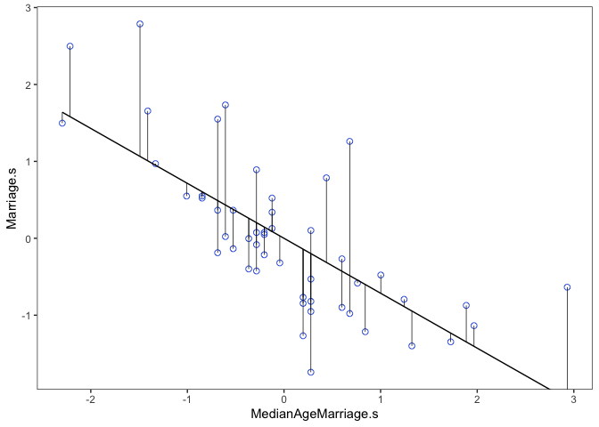
From here we would say that States with a positive residual marry fast for their age of marriage, while States with negative residuals marry slow for their age of marriage.
# make a data frame for ggplot
r <- m.resid %>%
  as.data.frame() %>%
  cbind(d)

# Create a predictor residual plot
prp1 <-
  r %>%
  ggplot(aes(x = m.resid, y = Divorce)) +
  geom_smooth(method = 'lm', formula = y ~ x,
              fullrange = TRUE,
              color = "grey", fill = "grey",
              alpha = 1/5, size = 1/2) +
  geom_vline(xintercept = 0, linetype = 2, color = "grey50") +
  geom_point(size = 2, color = "royalblue", alpha = 2/3) +
  annotate("text", x = c(-0.35, 0.35), y = 14.1, label = c("slower", "faster")) +
  scale_x_continuous("Marriage rate residuals", limits = c(-2, 2)) +
  coord_cartesian(xlim = range(m.resid),
                  ylim = c(6, 14.1)) +
  theme_bw() +
  theme(panel.grid = element_blank())
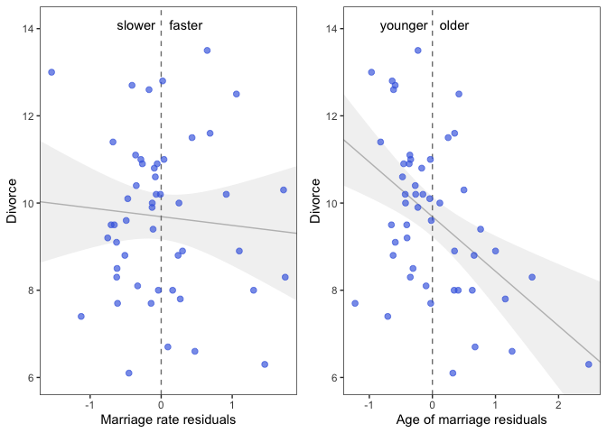
Interpretation: On the left we see that States with fast marriage rates for their median age of marriage have about the same divorce rates as States with slow marriage rates. On the right we see that States with an older median age of marriage for their marriage rate have lower divorce rates than States with a younger median age of marriage.
This is all a visual representation of what we saw when we made our multivariate model above, the slope of the regression lines are identical.
Counterfactual plots
These plots display the implied predicitions of the model. They are called counterfactual, because they can be used to visualize unobserved or even impossible combinations of predictor variables, such as a very high median age of marriage and very high marriage rate. The simplest use case is to see how predictions change as we modify only one predictor at a time. This will help us understand the implications of the model. Below is a walkthrough of how we create counterfactual plots.
First we need to build a new list of data that describes the cases we’re interested in. In this first plot we’re going to consider how marriage rate changes while keeping median age of marriage constant at it’s mean. Recall, since we standardized our variables, the mean of this will be zero. Also note that we’re not actually using any observations from our data set. This is important, we don’t want to double dip into our data. We also need to define the sequence over which we want to see changes in marriage rate. Remember, we standardized, so we only need to check values close to 0.
# prepare new counterfactual data
A.avg <- mean(d$MedianAgeMarriage.s)
R.seq <- seq(from = -3, to = 3, length.out = 30)
pred.data1 <- data.frame(
  Marriage.s = R.seq,
  MedianAgeMarriage.s = A.avg
)
Next we will create our model and then use link to compute values of our model over samples from the counterfactual data (pred.data1). Then we’ll simulate over that same data. The rest is just for plotting everything.
# compute counterfactual mean divorce (mu)
m <- map(
    alist(
        Divorce ~ dnorm(mu, sigma),
        mu <- alpha + betaR*Marriage.s + betaA*MedianAgeMarriage.s ,
        alpha ~ dnorm( 10 , 10 ) ,
        betaR ~ dnorm( 0 , 1 ) ,
        betaA ~ dnorm( 0 , 1 ) ,
        sigma ~ dunif( 0 , 10 )
), data = d )

mu <- link(m, data = pred.data1)
mu.mean <- apply(mu, 2, mean)
mu.PI <- apply(mu, 2, PI)

# simulate counterfactual divorce outcomes
R.sim <- sim(m, data = pred.data1, n = 1e4)
R.PI <- apply(R.sim, 2, PI)

# display predictions, hiding raw data with type = 'n'
plot(Divorce ~ Marriage.s, data = d, type = "n")
mtext("MedianAgeMarriage.s = 0")
lines(R.seq, mu.mean)
shade(mu.PI, R.seq)
shade(R.PI, R.seq)
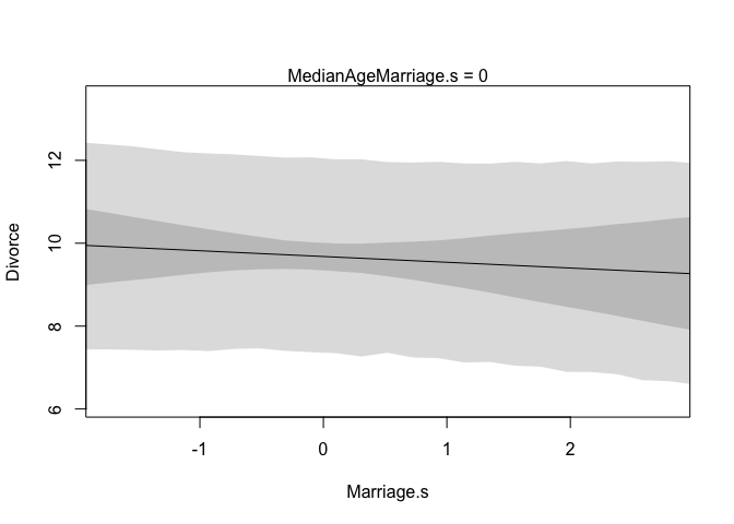 | 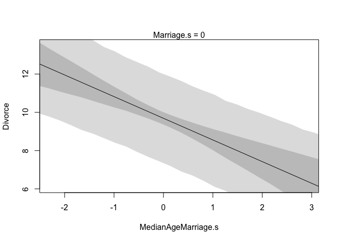 |
These plots should look familiar, and there’s good reason for that, they have the same slopes as the residual plots from before. They don’t however, display any raw or residual data because they are counterfactual. Additionally, since they display percentile intervals on the scale of the data, instead of the weird residual scale, they directly display the impact on prediction for a change in each variable.
A word of caution, remember that these are counterfactual plots. It’s not always possible to change one variable while expecting the other to stay constant. So while these plots help understand the model, they may be misleading by displaying predictions for impossible combinations of predictor values.
Posterior prediction plots
# call link without specifying new data
# so it uses original data
mu <- link(m)

# summarize samples across cases
mu.mean <- apply(mu, 2, mean)
mu.PI <- apply(mu, 2, PI)

# simulate observations
# again, no new data so uses original
divorce.sim <- sim(m, n = 1e4)
divorce.PI <- apply(divorce.sim, 2, PI)

# plot predictions against observed
plot(mu.mean ~ d$Divorce, col = rangi2, ylim = range(mu.PI),
     xlab = "observed divorce", ylab = "predicted divorce")
abline(a = 0, b = 1, lty = 2)
for ( i in 1:nrow(d) )
    lines( rep(d$Divorce[i],2) , c(mu.PI[1,i],mu.PI[2,i]) ,
        col=rangi2 )
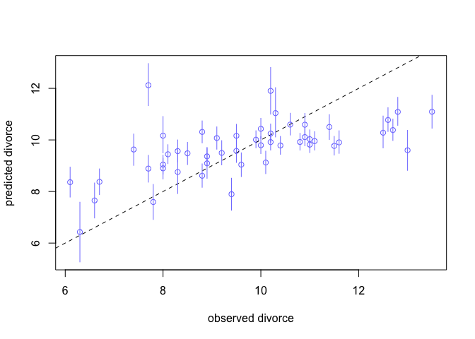
Interpretation: We see that our model underpredicts for states with very high divorce rates, and overpredicts for states with low divorce rates. This is nice but it’s hard to see the amount of prediction error.
# compute residuals
divorce.resid <- d$Divorce - mu.mean

# order by divorce rate
o <- order(divorce.resid)

# make the plot
dotchart(divorce.resid[o],
         labels = d$Loc[o],
         xlim = c(-6,5),
         cex = 0.6)
abline(v=0, col=col.alpha("black", 0.2))
for ( i in 1:nrow(d) ) {
    j <- o[i] # which State in order
    lines( d$Divorce[j]-c(mu.PI[1,j],mu.PI[2,j]) , rep(i,2) )
    points( d$Divorce[j]-c(divorce.PI[1,j],divorce.PI[2,j]) , rep(i,2),
    pch=3 , cex=0.5 , col="gray" )
}
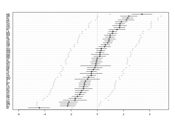
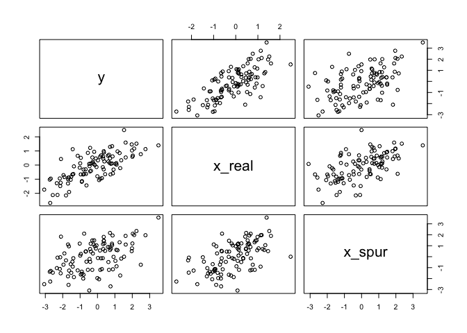
One way that spurious associations arise is when a truly causal predictor x_real, influences both the outcome, y, and a spurious predictor x_spur. Below we’ll simulate this sceniario to show how this scenario might arise and to prove that multiple regression can filter out the right predictor. As you’ll see in the table below, the mean for the association between y and x_spur is close to 0.
N <- 100
x_real <- rnorm(N)
x_spur <- rnorm(N, x_real)
y <- rnorm(N, x_real)
d <- data.frame(y, x_real, x_spur)

# notice both x_real and x_spur are correlated with y
pairs(d)
m <- quap(
  alist(
    y ~ dnorm( mu , sigma ),
    mu <- Intercept +
        b_real*x_real +
        b_spur*x_spur,
    Intercept ~ dnorm(0,10),
    b_real ~ dnorm(0,10),
    b_spur ~ dnorm(0,10),
    sigma ~ dunif(0,1)
), data = d)
precis(m)
| mean | sd | 5.5% | 94.5% | |
|---|---|---|---|---|
| (Intercept) | -0.17 | 0.10 | -0.33 | -0.01 |
| x_real | 1.02 | 0.16 | 0.77 | 1.27 |
| x_spur | -0.02 | 0.11 | -0.20 | 0.15 |
| sigma | 0.99 | 0.07 | 0.88 | 1.10 |
Masked relationships
As we just saw, multiple predictor variables can know out spurious associations, but they can also show relationships that would otherwise be hidden when only looking at bivariate relations. Specifically this can arise when two predictor variables are correlated with each other - but one is correlated positively with the outcome while the other is correlated negatively with the outcome.
To explore this further we’ll be looking at the milk dataset.
data(milk)
d <- milk
str(d)
## 'data.frame':	29 obs. of  8 variables:
##  $ clade         : Factor w/ 4 levels "Ape","New World Monkey",..: 4 4 4 4 4 2 2 2 2 2 ...
##  $ species       : Factor w/ 29 levels "A palliata","Alouatta seniculus",..: 11 8 9 10 16 2 1 6 28 27 ...
##  $ kcal.per.g    : num  0.49 0.51 0.46 0.48 0.6 0.47 0.56 0.89 0.91 0.92 ...
##  $ perc.fat      : num  16.6 19.3 14.1 14.9 27.3 ...
##  $ perc.protein  : num  15.4 16.9 16.9 13.2 19.5 ...
##  $ perc.lactose  : num  68 63.8 69 71.9 53.2 ...
##  $ mass          : num  1.95 2.09 2.51 1.62 2.19 5.25 5.37 2.51 0.71 0.68 ...
##  $ neocortex.perc: num  55.2 NA NA NA NA ...
The variables we’ll consider for now are:
- kcal.per.g: Kilocalories of energy per gram of milk
- mass: average female body mass, in kilograms
- neocortex.perc: The percent of total brain mass that is neocortex mass
The first model we’ll consider is a simple bivariate regression between kilocalories and neocortex percent.
# only focus on complete cases (no NAs)
dcc <- d[complete.cases(d), ]

m <- quap(
  alist(
    kcal.per.g ~ dnorm(mu, sigma),
    mu <- a + bn*neocortex.perc,
    a ~ dnorm(0, 100),
    bn ~ dnorm(0, 1),
    sigma ~ dunif(0, 1)
  ), data = dcc)

precis(m, digits = 3)
##              mean         sd         5.5%      94.5%
## a     0.353339076 0.47071829 -0.398959670 1.10563782
## bn    0.004503203 0.00694034 -0.006588801 0.01559521
## sigma 0.165702599 0.02841440  0.120290904 0.21111429
We can see that our beta value is pretty close to zero, but it’s not that precise. The 89% interval extends a good distance above and below zero too. We can plot this too to visualize it.
np.seq <- 0:100
pred.data <- data.frame(neocortex.perc = np.seq)

mu <- link(m, pred.data, n = 1e4)
mu.mean <- apply(mu, 2, mean)
mu.PI <- apply(mu, 2, PI)

plot(kcal.per.g ~ neocortex.perc, data = dcc, col=rangi2)
lines(np.seq, mu.mean)
lines(np.seq, mu.PI[1, ], lty=2)
lines(np.seq, mu.PI[2, ], lty=2)
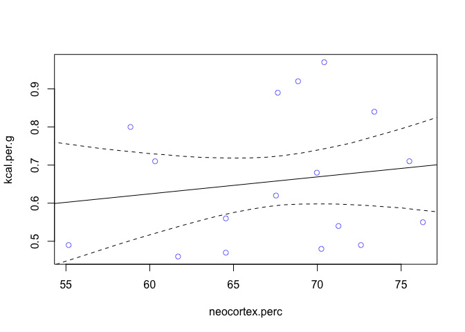
We can see now that it’s weakly positive, but highly imprecise. Now let’s look at mass, specifically log(mass) as a predictor.
dcc$log.mass <- log(dcc$mass)

m2 <- quap(
  alist(
    kcal.per.g ~ dnorm(mu, sigma),
    mu <- a + bm*log.mass,
    a ~ dnorm(0, 100),
    bm ~ dnorm(0, 1),
    sigma ~ dunif(0, 1)
  ), data = dcc)

precis(m2, digits = 3)
##              mean         sd        5.5%        94.5%
## a      0.70513745 0.04870549  0.62729667 0.7829782380
## bm    -0.03167301 0.02028328 -0.06408961 0.0007435839
## sigma  0.15686209 0.02689767  0.11387442 0.1998497613
lm.seq <- seq(-3, 5, length.out = 30)
pred.data <- data.frame(log.mass = lm.seq)

mu2 <- link(m2, pred.data, n = 1e4)
mu2.mean <- apply(mu2, 2, mean)
mu2.PI <- apply(mu2, 2, PI)

plot(kcal.per.g ~ log.mass, data = dcc, col=rangi2)
lines(lm.seq, mu2.mean)
lines(lm.seq, mu2.PI[1, ], lty=2)
lines(lm.seq, mu2.PI[2, ], lty=2)
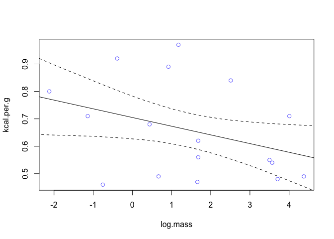
We find that log-mass is negatively correlated with kilocalories. The influence seems stronger than that of neocortex percent but in the opposite direction. But it’s also uncertain, it includes a wide range confidence interval that includes both strong and weak relationships.
Now we’ll see what happens when we combine the two.
m <- quap(
  alist(
    kcal.per.g ~ dnorm(mu, sigma),
    mu <- a + bn*neocortex.perc + bm*log.mass,
    a ~ dnorm(0, 100),
    bn ~ dnorm(0, 1),
    bm ~ dnorm(0, 1),
    sigma ~ dunif(0, 1)
  ), data = dcc)

precis(m)
##              mean          sd        5.5%       94.5%
## a     -1.08440904 0.467561106 -1.83166199 -0.33715609
## bn     0.02791697 0.007272705  0.01629379  0.03954016
## bm    -0.09634939 0.022454236 -0.13223559 -0.06046318
## sigma  0.11479317 0.019681998  0.08333753  0.14624880
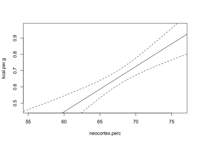
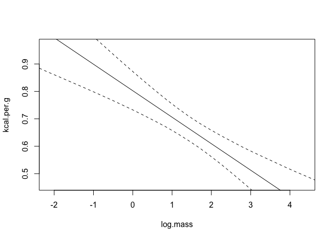
Look at that! By including both predictor values in the regression, the estimated association of both with the outcome has increased. The posterior mean for neocortex (bn) has increased dramatically and now it’s 89% percentile interval is completely above zero. Likewise, the posterior mean for log body mass is now more strongly negative.
Let’s now look at some counterfactual plots of this. We’ll keep log body mass constant at it’s mean for the plot of neocortex percent, and similarly neocortex percent constant for the other chart.
 |  |
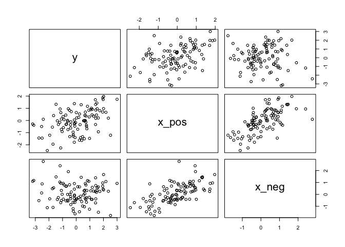
Let’s do another deep dive and create and artificial example of this happening. Suppose a single outcome
N <- 100                           # number of cases
rho <- 0.7                         # correlation between x_pos and x_neg
x_pos <- rnorm(N)                  # x_pos as gaussian
x_neg <- rnorm(N, rho*x_pos,       # x_neg correlated with x_pos
               sqrt(1-rho^2))
y <- rnorm(N, x_pos - x_neg)       # y equally associated with x_pos, x_neg
d <- data.frame(y, x_pos, x_neg)   # bind all together in data frame

pairs(d)
m1 <- quap(
  alist(
    y ~ dnorm( mu , sigma ),
    mu <- a +
        b_pos*x_pos,
    a ~ dnorm(0,10),
    b_pos ~ dnorm(0,10),
    sigma ~ dunif(0,5)
), data = d)

m2 <- quap(
  alist(
    y ~ dnorm( mu , sigma ),
    mu <- a +
        b_neg*x_neg,
    a ~ dnorm(0,10),
    b_neg ~ dnorm(0,10),
    sigma ~ dunif(0,5)
), data = d)

m3 <- quap(
  alist(
    y ~ dnorm( mu , sigma ),
    mu <- a +
        b_pos*x_pos +
        b_neg*x_neg,
    a ~ dnorm(0,10),
    b_pos ~ dnorm(0,10),
    b_neg ~ dnorm(0,10),
    sigma ~ dunif(0,5)
), data = d)

precis(m1)
precis(m2)
precis(m3)
| mean | sd | 5.5% | 94.5% | |
|---|---|---|---|---|
| a | -0.09 | 0.12 | -0.27 | 0.10 |
| b_pos | 0.54 | 0.11 | 0.36 | 0.72 |
| sigma | 1.15 | 0.08 | 1.02 | 1.08 |
| mean | sd | 5.5% | 94.5% | |
|---|---|---|---|---|
| a | -0.06 | 0.13 | -0.27 | 0.14 |
| b_neg | -0.08 | 0.14 | -0.30 | 0.15 |
| sigma | 1.27 | 0.09 | 1.13 | 1.42 |
| mean | sd | 5.5% | 94.5% | |
|---|---|---|---|---|
| a | -0.11 | 0.10 | -0.28 | 0.05 |
| b_pos | 0.92 | 0.13 | 0.72 | 1.13 |
| b_neg | -0.70 | 0.14 | -0.93 | -0.47 |
| sigma | 1.03 | 0.07 | 0.91 | 1.15 |
Using just
When adding variables hurts
There are several reasons why we shouldn’t just include every variable avaiable to us in a regression. We’re going to cover three:
- Multicollinearity: when there is a strong correlation between two or more predictors.
- Post-treatment bias
- Overfitting
Multicollinearity
We need to watch out for this, as it can result in a posterior distribution that will suggest that a large range of parameter values are plausible, even if all the variables are strongly associated with the outcome.
Let’s look at an example. Suppose we want to predict an individuals height given the length of their legs.
N <- 100
height <- rnorm(N,10,2)
leg_prop <- runif(N,0.4,0.5)
leg_left <- leg_prop*height +
    rnorm( N , 0 , 0.02 )
leg_right <- leg_prop*height +
    rnorm( N , 0 , 0.02 )
d <- data.frame(height,leg_left,leg_right)
Before we analyze the model, let’s go over what we expect to see. On average, a persons legs will be 45% of their height. Since the average height for a person here is 10, the average length of a leg should be around
m <- quap(
  alist(
    height ~ dnorm( mu , sigma ) ,
    mu <- a + bl*leg_left + br*leg_right ,
    a ~ dnorm( 10 , 100 ) ,
    bl ~ dnorm( 2 , 10 ) ,
    br ~ dnorm( 2 , 10 ) ,
    sigma ~ dunif( 0 , 10 )
), data=d )

precis(m)
##            mean         sd       5.5%     94.5%
## a     0.8569344 0.26326835  0.4361807 1.2776881
## bl    1.3828042 1.97368350 -1.7715232 4.5371316
## br    0.6381013 1.97449072 -2.5175162 3.7937188
## sigma 0.5759818 0.04072821  0.5108902 0.6410733
plot(precis(m))
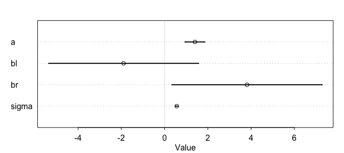
As we can see here from the table, something is clearly off, and look at the intervals for each of the beta coefficients! So what happened here? Recall that a multiple linear regression answers the question, what is the value of knowing each predictor, after knowing all the other predictors? Which here becomes, what is the value of knowing each leg’s length, after already knowing the other legs length?
It might help to look at the bivariate posterior distribution for bl and br.
post <- extract.samples(m)
plot(bl ~ br, data = post, col=col.alpha(rangi2, 0.1), pch=16)
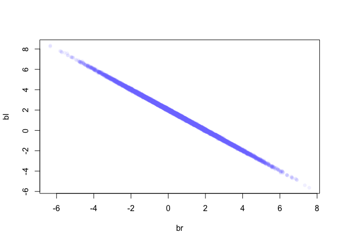
As we can see here, these two values are highly correlated, when br is large then bl must bel small and vice versa. So what happened was, since these variables contain almost the exact same information, if we insist on including both in the model then there’s practically an infinite number of combinations of bl and br that produce the same predictions.
Effectively, what we’ve done here is calculate
We can see this too when we look at their posterior distribution. Notice how the posterior distribution of the sum is much closer to our expected value, and how it has a much smaller standard deviation than either of them individually.
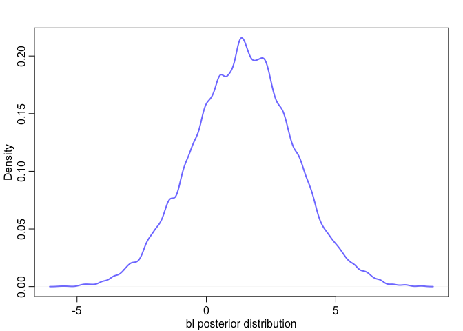 | 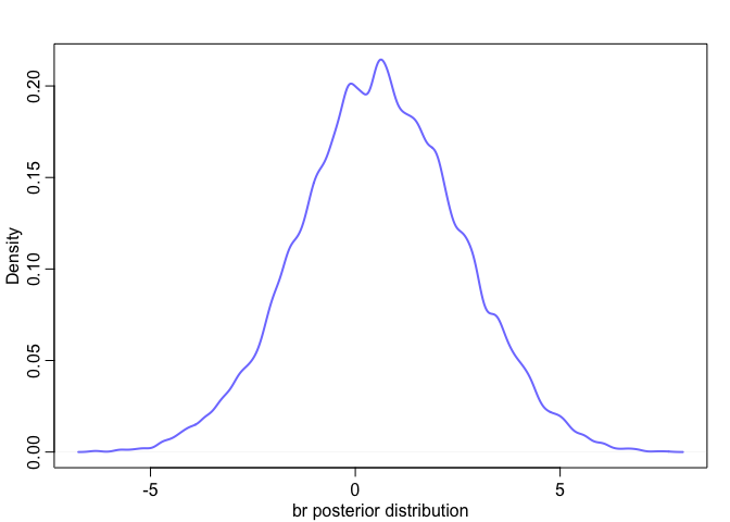 |
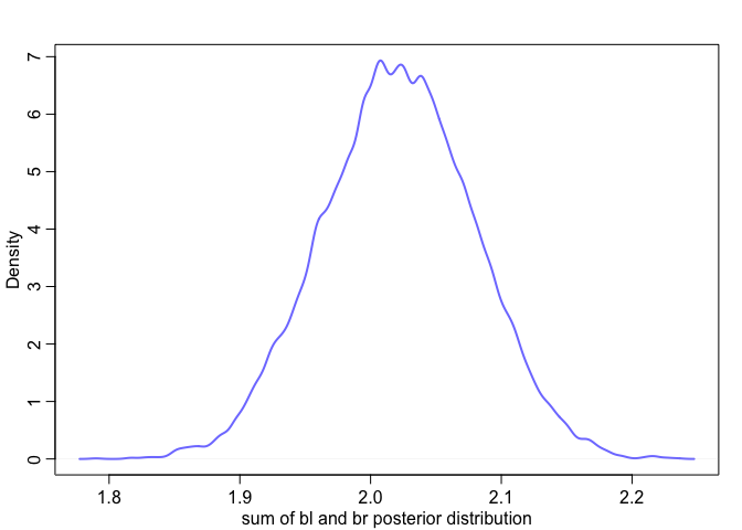 |
We can also see this by just incorporating one of the variables. Notice how now the posterior mean is much closer to our expected value.
m <- quap(
  alist(
    height ~ dnorm(mu, sigma),
    mu <- a + bl*leg_left,
    a ~ dnorm(10, 100),
    bl ~ dnorm(2, 10),
    sigma ~ dunif(0, 10)
  ), data = d)

precis(m)
##            mean         sd      5.5%     94.5%
## a     0.8585479 0.26323933 0.4378406 1.2792552
## bl    2.0205425 0.05851648 1.9270218 2.1140631
## sigma 0.5761323 0.04072824 0.5110407 0.6412239
So how strong does a correlation need to be before we should worry about it? Well that’s a tricky question to answer, in part because it’s not just about the correlation between a pair of variables, but rather, the correlation that remains after accounting for any other predictors.
We can anticipate problems by looking at pairs plots, and know that any predictors with large correlations of around 0.9 may be problematic.
Post-treatment bias
Omitted variable bias: Mistakes in inference that arise from omitting predictor variables
Post-treatment bias: Mistakes in inference that arise from including variables that are consequences of other variables
Example: Suppose we’re growing plants and want to know the diffenece in growth using different anti fungal soil treatments - fungus tends to reduce plant growth. We’ll measure four things:
- h0: initial plant height
- h1: final plant height
- treatment: either 0 or 1
- fungus: 50% chance if no treatment is present, 10% chance otherwise
N <- 100
h0 <- rnorm(N, 10, 2)

treatment <- rep(0:1, N/2)
fungus <- rbinom(N, 1, prob = 0.5 - 0.4*treatment)
h1 <- h0 + rnorm(N, 5 - 3*fungus)

d <- data.frame(h0 = h0, treatment = treatment, fungus = fungus, h1 = h1)

m5.13 <- quap(
  alist(
    h1 ~ dnorm(mu, sigma),
    mu <- a + bh*h0 + bt*treatment + bf*fungus,
    a ~ dnorm(0, 100),
    c(bh, bt, bf) ~ dnorm(0, 10),
    sigma ~ dunif(0, 10)
  ), data = d)

m5.14 <- quap(
  alist(
    h1 ~ dnorm(mu, sigma),
    mu <- a + bh*h0 + bt*treatment,
    a ~ dnorm(0, 100),
    c(bh, bt) ~ dnorm(0, 10),
    sigma ~ dunif(0, 10)
  ), data = d)

precis(m5.13)
##             mean         sd        5.5%      94.5%
## a      4.0737384 0.47093879  3.32108721  4.8263895
## bh     1.0692673 0.04330740  1.00005368  1.1384808
## bt     0.2503074 0.20995049 -0.08523401  0.5858488
## bf    -2.7207312 0.22396812 -3.07867550 -2.3627869
## sigma  0.9156423 0.06474544  0.81216655  1.0191180
precis(m5.14)
##           mean         sd     5.5%    94.5%
## a     2.122028 0.69656769 1.008778 3.235277
## bh    1.112972 0.06791112 1.004437 1.221507
## bt    1.487470 0.28878305 1.025939 1.949001
## sigma 1.440859 0.10188399 1.278029 1.603690
Categorical variables
Binary categories
Let’s look at a simple case of how height varies between gender within the Kalahari dataset.
data("Howell1")
d <- Howell1
str(d)
## 'data.frame':	544 obs. of  4 variables:
##  $ height: num  152 140 137 157 145 ...
##  $ weight: num  47.8 36.5 31.9 53 41.3 ...
##  $ age   : num  63 63 65 41 51 35 32 27 19 54 ...
##  $ male  : int  1 0 0 1 0 1 0 1 0 1 ...
Notice how male is represented by a 1, and female is 0. This is important to note when it comes to interpreting our model.
m5.15 <- quap(
  alist(
    height ~ dnorm(mu, sigma),
    mu <- a + bm*male,
    a ~ dnorm(178, 100),
    bm ~ dnorm(0, 10),
    sigma ~ dunif(0, 50)
  ), data = d)

precis(m5.15)
##             mean       sd       5.5%     94.5%
## a     134.830632 1.591877 132.286504 137.37476
## bm      7.279189 2.283350   3.629954  10.92842
## sigma  27.309251 0.827978  25.985982  28.63252
Since we encoded female as 0,
This is all fine and good for the posterior mean, but when considering the width of the posterior distribution for average male height we need to take one extra step. Since the
post <- extract.samples(m5.15)
mu.male <- post$a + post$bm
PI(mu.male)
##       5%      94%
## 139.4498 144.8117
Multiple Categories
What happens when you have multiple categories? Let’s look at the milk dataset again, specifically the clade column, which contains different species.
data("milk")
d <- milk
unique(d$clade)
## [1] Strepsirrhine    New World Monkey Old World Monkey Ape
## Levels: Ape New World Monkey Old World Monkey Strepsirrhine
We need to convert these to dummy variable, with the exception of one, which will be represented by the intercept.
d$clade.NWM <- ifelse(d$clade == "New World Monkey", 1, 0)
d$clade.OWM <- ifelse(d$clade == "Old World Monkey", 1, 0)
d$clade.S <- ifelse(d$clade == "Strepsirrhine", 1, 0)
Now we’ll have covered all the possibilities.
| Category | ||||
|---|---|---|---|---|
| Ape | 0 | 0 | 0 | |
| New World Monkey | 1 | 0 | 0 | |
| Old World Monkey | 0 | 1 | 0 | |
| Strepsirrhine | 0 | 0 | 1 |
m5.16 <- map(
    alist(
        kcal.per.g ~ dnorm( mu , sigma ) ,
        mu <- a + b.NWM*clade.NWM + b.OWM*clade.OWM + b.S*clade.S ,
        a ~ dnorm( 0.6 , 10 ) ,
        b.NWM ~ dnorm( 0 , 1 ) ,
        b.OWM ~ dnorm( 0 , 1 ) ,
        b.S ~ dnorm( 0 , 1 ) ,
        sigma ~ dunif( 0 , 10 )
),
    data=d )
precis(m5.16)
| mean | sd | 5.5% | 94.5% | |
|---|---|---|---|---|
| a | 0.55 | 0.04 | 0.49 | 0.61 |
| b.NWM | 0.17 | 0.05 | 0.08 | 0.25 |
| b.OWM | 0.24 | 0.06 | 0.15 | 0.34 |
| b.S | -0.04 | 0.06 | -0.14 | 0.06 |
| sigma | 0.11 | 0.02 | 0.09 | 0.14 |
Again,
post <- extract.samples(m5.16)

mu.ape <- post$a
mu.NWM <- post$a + post$b.NWM
mu.OWM <- post$a + post$b.OWM
mu.S <- post$a + post$b.S

precis(data.frame(mu.ape,mu.NWM,mu.OWM,mu.S) )
| mean | sd | 5.5% | 94.5% | |
|---|---|---|---|---|
| mu.ape | 0.55 | 0.04 | 0.49 | 0.61 |
| mu.NWM | 0.72 | 0.04 | 0.65 | 0.78 |
| mu.OWM | 0.79 | 0.05 | 0.71 | 0.86 |
| mu.S | 0.51 | 0.05 | 0.43 | 0.59 |
Unique intercepts
We’ll touch upon this briefly and come back to it later on when discussing multilevel models, but you can also create an index variable to specify which parameter goes with each case.
d$clade_id <- coerce_index(d$clade)

m5.16_alt <- quap(
    alist(
        kcal.per.g ~ dnorm( mu , sigma ) ,
        mu <- a[clade_id] ,
        a[clade_id] ~ dnorm( 0.6 , 10 ) ,
        sigma ~ dunif( 0 , 10 )
),
    data=d )
precis( m5.16_alt , depth=2 )
| mean | sd | 5.5% | 94.5% | |
|---|---|---|---|---|
| a[1] | 0.55 | 0.04 | 0.48 | 0.61 |
| a[2] | 0.71 | 0.04 | 0.65 | 0.78 |
| a[3] | 0.79 | 0.05 | 0.71 | 0.86 |
| a[4] | 0.51 | 0.05 | 0.43 | 0.59 |
| sigma | 0.11 | 0.02 | 0.09 | 0.14 |